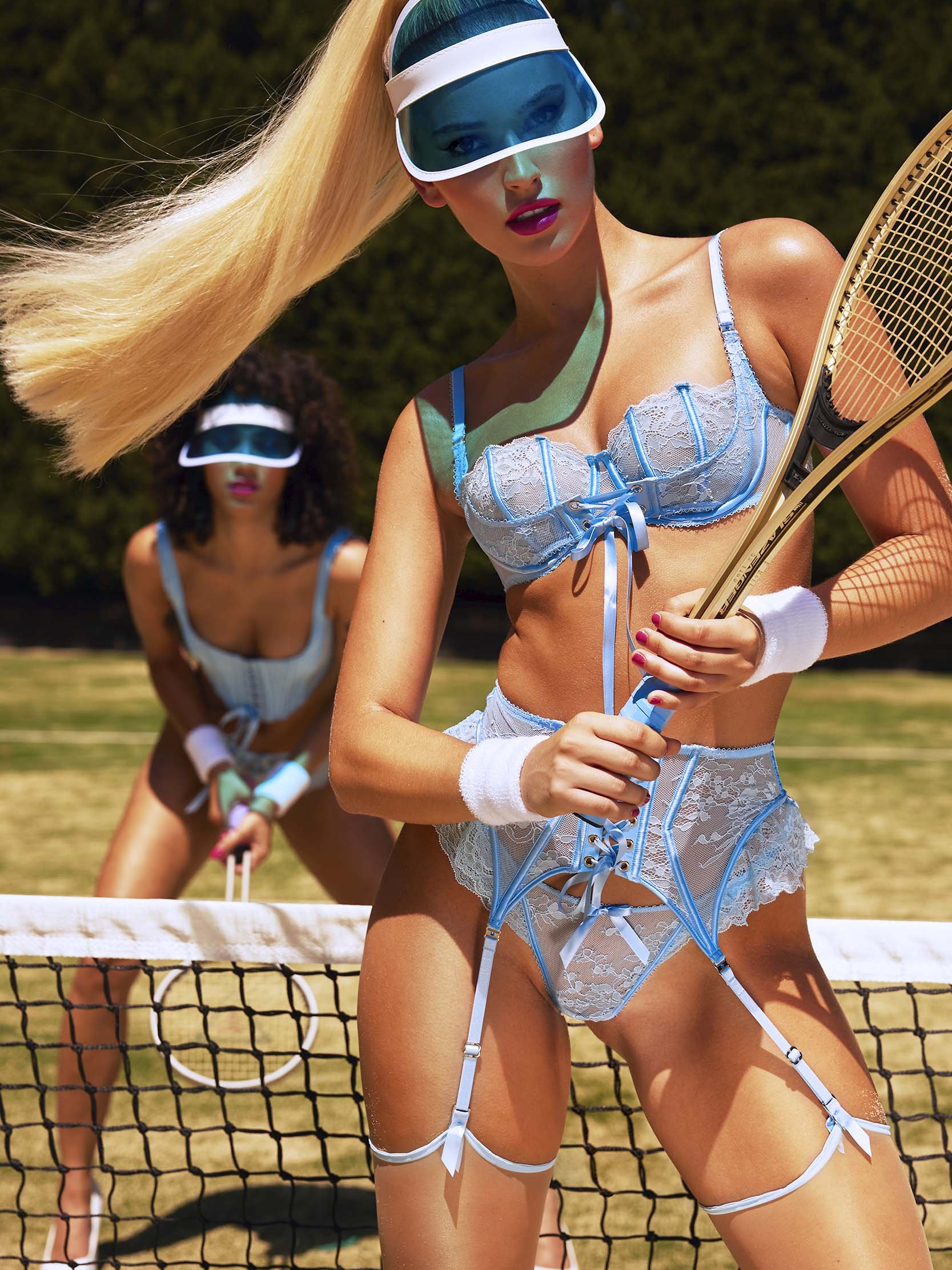
HONEY BIRDETTE: ANYONE FOR TENNIS?
ROLE : CREATIVE DIRECTION
SCOPE : ConcepT IDEATION, Art Direction, Photography, Video, Visual Identity, Production
Project
A marketing campaign created to differentiate HB by taking lingerie out of its usual context and placing it somewhere it clearly doesn’t belong, worn with attitude by girls who don’t like to lose. chic, playful, and confident, with a light sense of mischief.
Approach
Displaced traditional lingerie codes by borrowing the visual language of tennis
Used contrast and attitude to create sexiness without relying on classic seduction
Built an intentionally vibrant color palette to reflect the energy of a spring collection
Played with posture, tension, and character to give the campaign a slightly bratty edge
Treated the campaign as a complete visual system rather than a single image
Execution
Campaign concept and creative direction
Storyboards, casting, and location scouting
On-set direction and shoot supervision
Photography EXECUTION and video direction
Creation of the campaign visual identity (typography, color grading, overall look & feel)
Editing of all still and motion formats (campaign, reels, stories)
Production of assets for social, online, and print
Design of the printed catalogue
Impact
The campaign established a distinctive visual territory for HB, clearly separating it from traditional lingerie imagery. Rolled out across social, online, and print, the content generated strong engagement on digital platforms and supported commercial objectives, with assets designed for adaptability, reach, and sustained performance across channels.


PHOTOGRAPHY
Selected stills from the campaign.


